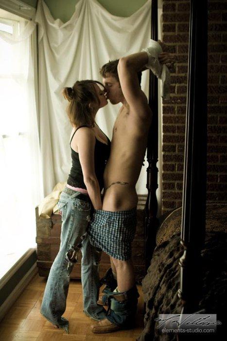
It’s sometimes interesting to follow the path of an image on tumblr. I’ve seen this one pop up repeatedly in different variations. I think it’s a great image. I love the way he’s restrained and yet open. She can tantalize him with a gentle kiss or squeeze her hand to inflict a little pain. As far as I can tell this is the original format format from elements studio (although I can’t find it on their site). Yet I’ve seen it in black and white, or with the logo surgically removed or in various cropped forms that alter the focus and overall composition. I’ve no idea why this particular image has been tweaked so often, as it works wonderfully as is.
